Pace vs Consistency Charts: Visualizing Performance Metrics
# Pace vs Consistency Charts: Visualizing Performance Metrics
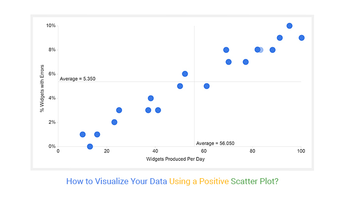
About Pace vs Consistency
Pace vs Consistency charts are scatter plots that map two critical performance metrics: pace and consistency. These charts provide a visual representation of how different drivers or performers compare against each other, offering insights into their strengths and weaknesses. The visual impact of these charts lies in their ability to quickly convey complex data in an easily digestible format, making them ideal for sports analysis, business performance reviews, and educational content.
Features
- Scatter Plot Visualization: Users get a clear and concise visual representation of data points, making it easy to identify trends and outliers.
- Trend Line Integration: The inclusion of a trend line helps users understand the overall direction and correlation between pace and consistency.
- Customizable Themes: With dark broadcast themes, users can match the chart's appearance to their video's aesthetic, ensuring a cohesive look.
- Data-Driven Insights: Users benefit from data-driven insights that can inform strategic decisions and performance improvements.
- Easy Integration: These charts can be easily integrated into video projects, enhancing the professionalism and depth of the content.
When to Use Pace vs Consistency
- Sports Analysis: Ideal for analyzing athlete performance, comparing different players, and tracking progress over time.
- Business Performance Reviews: Useful for visualizing employee performance, project timelines, and productivity metrics.
- Educational Content: Effective for teaching statistical concepts, data analysis, and performance metrics in an engaging way.
How to Apply
1. Gather Data: Collect the necessary data points for pace and consistency. Ensure the data is accurate and relevant to the analysis.
2. Input Data: Use the chart template to input the data. The platform will automatically generate the scatter plot and trend line.
3. Customize Appearance: Adjust the theme and appearance of the chart to match your video's aesthetic. Choose from various color schemes and styles.
4. Integrate into Video: Export the chart and integrate it into your video project. Use transitions and animations to enhance the visual appeal.
5. Analyze and Present: Use the chart to analyze the data and present your findings. Highlight key insights and trends to make your content more engaging and informative.
For more chart templates, check out the Lap Time Comparison and Head-to-Head effects.
Frequently Asked Questions
Ready to try AI video creation?
Start with 200 free credits. No credit card required.
Get Started Free200 credits included · Cancel anytime